
The responsive design world is constantly evolving, and with it the W3C recommendations and working drafts, in particular concerning the CSS standards evolution. Typography has its word too, and web font usage brings its share of solutions. This articles brings out a series of relevant links and articles to pursue a longstanding discussion.
In paper magazines, text is way fluider than on the web: it can follow the curves of a picture, or fill in complex shapes. This is what CSS exclusions are enabling, with an appealing visual result. The regions and flow define the areas where the text is displayed in a fluid way. When the user zooms in or changes its characters size, the design remains the same, as the text is adapting itself in a fluid manner within the areas allowed to it. The actual support of this working draft is more than limited, but as often nowadays, a polyfill already allows us to use them.
The flexibility of a tabulation built in CSS (hence adaptative) and the conventional table layout like in the old days of HTML. With the multi-columns layout (W3C candidate recommendation), it is possible to specify the number of columns of an element and their spacing, or only the width of a column, letting the browser choose how many columns it can display. This recommendation is not yet supported by all the main browsers (IE is supporting it only from its version 10), but a polyfill has been developed as a jQuery plugin.
The choice of the font size to display cannot depend only on the designer personal taste, as the apocalypse zombie is already upon us. The context of use is as important (or even more) than screen size. The true question to answer is now: at which screen distance the user is reading? The font face, line height and contrast choices are following that decision.
Rather than basing our media queries control points and breakpoints on pixels, whether the former depend on our design in particular, or on the viewport of the device used to display it, why not base them on a more relative measure unit, like em? This is what Lyza Gardner was already advocating for in March 2012. One of the advantages of this approach is that if the user zooms in or out by changing her font size, the design adapts itself and does not break.
Using web fonts to give some style to your site can cause a relatively common mistake, the one of faux italic or faux bold. By applying the <em> (or <i>) tag to an element without having defined the matching italic font family let the browser italicize the base font by slanting its characters, which can give some quirkiness to your texts. This typographic faux pas does not only bother the aesthetes, but can limit the text readability. It would be a shame not to correct it.
How to display a YouTube video or a SlideShare presentation that would adapt to the screen size while keeping its ratio? Here is an already old solution only based on CSS which embeds the iframe without using the HTML5 video tag.
To dive deeper in the understanding of RWD, I recommend you these two books:

Responsive Web Design by Example, by Thoriq Firdaus, editions Packt Publishing (March 2013)
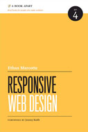
And the classic Responsive Web design, by Ethan Marcotte, A Book Apart editions (2011)
CSS regions and flow
In paper magazines, text is way fluider than on the web: it can follow the curves of a picture, or fill in complex shapes. This is what CSS exclusions are enabling, with an appealing visual result. The regions and flow define the areas where the text is displayed in a fluid way. When the user zooms in or changes its characters size, the design remains the same, as the text is adapting itself in a fluid manner within the areas allowed to it. The actual support of this working draft is more than limited, but as often nowadays, a polyfill already allows us to use them.
CSS columns
The flexibility of a tabulation built in CSS (hence adaptative) and the conventional table layout like in the old days of HTML. With the multi-columns layout (W3C candidate recommendation), it is possible to specify the number of columns of an element and their spacing, or only the width of a column, letting the browser choose how many columns it can display. This recommendation is not yet supported by all the main browsers (IE is supporting it only from its version 10), but a polyfill has been developed as a jQuery plugin.
What font size to display?
The choice of the font size to display cannot depend only on the designer personal taste, as the apocalypse zombie is already upon us. The context of use is as important (or even more) than screen size. The true question to answer is now: at which screen distance the user is reading? The font face, line height and contrast choices are following that decision.
Responsive typography: em and not pixels
Rather than basing our media queries control points and breakpoints on pixels, whether the former depend on our design in particular, or on the viewport of the device used to display it, why not base them on a more relative measure unit, like em? This is what Lyza Gardner was already advocating for in March 2012. One of the advantages of this approach is that if the user zooms in or out by changing her font size, the design adapts itself and does not break.
Typographic faux pas
Using web fonts to give some style to your site can cause a relatively common mistake, the one of faux italic or faux bold. By applying the <em> (or <i>) tag to an element without having defined the matching italic font family let the browser italicize the base font by slanting its characters, which can give some quirkiness to your texts. This typographic faux pas does not only bother the aesthetes, but can limit the text readability. It would be a shame not to correct it.
Responsive videos
How to display a YouTube video or a SlideShare presentation that would adapt to the screen size while keeping its ratio? Here is an already old solution only based on CSS which embeds the iframe without using the HTML5 video tag.
Some readings
To dive deeper in the understanding of RWD, I recommend you these two books:
Responsive Web Design by Example, by Thoriq Firdaus, editions Packt Publishing (March 2013)
And the classic Responsive Web design, by Ethan Marcotte, A Book Apart editions (2011)
Quelques nouveautés du design responsif (in French)
Algúno nuevo en el diseño de respuesta (in Spanish)
Algumas novidades do design responsivo (in Portuguese)
No comments:
Post a Comment