Hosted by Coursera, this Human-Computer Interaction course from the University of California in San Diego is presented by Scott Klemmer, Associate Professor of Cognitive Science and Computer Science and Engineering. It presents the concepts of prototyping, comparative evaluation, the principles of visual design, of perception and cognition. To sum it up, it helps building human-centered design skills.
Now associate professor at UC San Diego, Scott Klemmer previously worked at Stanford University where he co-directed the HCI Group. He helped introduce peer assessment to open online education, and taught the first peer-assessed online course. He is also a researcher in Human-Computer Interaction.
With a duration time of seven weeks, this course is divided into seven modules, namely: introduction, needfinding (getting design insights from users observation), rapid prototyping, heuristic evaluation, direct manipulation and representations, visual design and information design, and designing experiments. Each module is made of four to five videos with a medium duration of 15 minutes. Each video contains one or two in-video quizzes which let seep in one of the most important points of the course. There is a total of four quizzes during the course, hence each of them encompasses multiple modules. While all the video lectures are available from week one, the quizzes, as well as the assignments, can be taken only during a specific time frame with a due date.
There are six assignments throughout the course to build a design project. Three design briefs are proposed (and are also available in Spanish) and the student has to select one. As the assignments are built on each other, the end result is a completed design project. Needfinding, storyboarding, wireframing, building of a high-fidelity prototype, evaluation plan, and user testing: each step leads to the next.
There are three separate tracks for grading, depending on the tasks followed by the student: apprentice track (quizzes only), studio track (quizzes and assignments), and studio practicum (assignments, the student having received an apprentice or studio Statement of Accomplishment from a previous session). Each of them results in a Statement of Accomplishment if the final grade in 80% or higher.
In terms of accessibility, the videos can be downloaded, as the subtitles (in both .txt and .srt file format) and the slides. For the benefit of international students, the videos can be subtitled in a wide array of languages, depending of the video: English, Spanish, French, Portuguese, German, Turkish, Japanese and Chinese subtitles are often provided. The video lectures are also available on a YouTube channel.
The followed session, from June to August 2014, counted about 29.5 thousand participants.
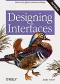
Designing Interfaces, by Jenifer Tidwell, O’Reilly Media (2011)
Designing the User Interface: Strategies for Effective Human-Computer Interaction, by Ben Shneiderman, Catherine Plaisant, Maxine Cohen and Steven Jacobs, Prentice Hall (2009)
Presentation
Now associate professor at UC San Diego, Scott Klemmer previously worked at Stanford University where he co-directed the HCI Group. He helped introduce peer assessment to open online education, and taught the first peer-assessed online course. He is also a researcher in Human-Computer Interaction.
With a duration time of seven weeks, this course is divided into seven modules, namely: introduction, needfinding (getting design insights from users observation), rapid prototyping, heuristic evaluation, direct manipulation and representations, visual design and information design, and designing experiments. Each module is made of four to five videos with a medium duration of 15 minutes. Each video contains one or two in-video quizzes which let seep in one of the most important points of the course. There is a total of four quizzes during the course, hence each of them encompasses multiple modules. While all the video lectures are available from week one, the quizzes, as well as the assignments, can be taken only during a specific time frame with a due date.
There are six assignments throughout the course to build a design project. Three design briefs are proposed (and are also available in Spanish) and the student has to select one. As the assignments are built on each other, the end result is a completed design project. Needfinding, storyboarding, wireframing, building of a high-fidelity prototype, evaluation plan, and user testing: each step leads to the next.
There are three separate tracks for grading, depending on the tasks followed by the student: apprentice track (quizzes only), studio track (quizzes and assignments), and studio practicum (assignments, the student having received an apprentice or studio Statement of Accomplishment from a previous session). Each of them results in a Statement of Accomplishment if the final grade in 80% or higher.
In terms of accessibility, the videos can be downloaded, as the subtitles (in both .txt and .srt file format) and the slides. For the benefit of international students, the videos can be subtitled in a wide array of languages, depending of the video: English, Spanish, French, Portuguese, German, Turkish, Japanese and Chinese subtitles are often provided. The video lectures are also available on a YouTube channel.
The followed session, from June to August 2014, counted about 29.5 thousand participants.
Notes and thoughts
- Here are some needfinding strategies to come up with innovative ideas: direct observation (what users do vs. what they say), participant observation, practiceship, interviews with open-ended, non directed questions, diaries, experience sampling.
- A good way to find ideas is to observe lead users (for their solution-oriented approach) and extreme users (for their pushing-the-limits approach), but we should never forget the regular users. That is why personas, or abstract users, can encompass a wide range of types of users.
- A storyboard is about a task, not an interface. Hence it should convey motivation, a setting, a sequence, and the satisfaction of its characters (the users).
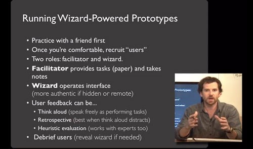
- Wizard-of-Oz prototypes mimic a real interface and help getting feedback from users. But they need to remain faster, cheaper and easier to produce than actual interfaces. It reminds me of a neat Balsamiq mockup interface I made for a client. Even though the design elements were rough and sketchy, I had to consistently remind the client that it was not the real thing she was interacting with, going from page to page and form to form, and that anything could be changed at no cost. The seemingly high-fidelity of that mockup prevented her to ask for changes, and it made her think the end product would be delivered within a few days, while not one line of code was written yet. In early stages, a rough paper prototype has many advantages over a hi-fidelity one.
- Functional fixation is bad: while prototyping, prefer quantity to quality.
- Not only sharing multiple designs help the team building (focusing on artifacts rather than on egos), the end result is better (more clicks for a new ad for example).
- There are multiple ways to evaluate a system (design, architecture and flow of the user interface): empirical (assess with real users), formal (models and formulas to calculate measures), automated (software measures), and critique (expertise and heuristic feedback).
- Heuristic evaluation is about using multiple evaluators trying the design independently, then you have to aggregate the results. This cost-effective approach saves on user testing, can have a huge benefit/cost ratio, and covers a wide array of problems.
- Design heuristics: show system status (time, space, change, action, next steps, completion), familiar metaphors and language, control and freedom (to undo, to explore), consistency (layout, language, choices), error prevention (prevent data loss, confusing flow, bad input, unnecessary constraints), recognition over recall (avoid codes and extra hurdles, offer previews), flexibility and efficiency (flexible shortcuts, defaults with options, ambient information, proactivity, (relevant) recommendations), aesthetic and minimalist design (above the fold, signal-to-noise, redundancy, functionality), recognize, diagnose and recover from errors (make problem clear, provide a solution, show a path forward, propose an alternative by relaxing the constraints), help (choices with examples, guide the way, show the steps, provide more information).
- An interface should provide enough affordance for the user to understand its use by themselves, or be backed by the right metaphor. It should match the users’ mental model, even though it works completely differently under the hood.
- There are two types of errors: slips and mistakes. A slip occurs when the user understands the model but makes an error like clicking on the wrong button, whereas a mistake occurs when the user rightly uses the interface but based on wrong beliefs (or on using the wrong type of files to process for a data entry program). To prevent a slip, the ergonomics and visual design have to be perfected with better labels, bigger buttons, better use of space and colors… A mistake should be addressed by clearer options and better feedback.
- Visual design has three main goals: to guide (convey structure, relative importance, relationships), to set up a pace (draw people in, help orient, provide hooks to dive deep), and to express the message (express meaning and style, breathe life into the content).
- The technological legacy of typography still lives in its terms, as they are still based on the lead blocks of Gutenberg’s age: point size, leading, x-height, weight…
- Designing studies: manipulate independent variables, but measure dependent variables (from the user’s perspective).
- In-person experiments: tell the testers this is the system that is tested not them. Choose between think aloud approach and timing tasks.
- Running web experiments: any design change, even as small as changing the white-space ratio, can have significant effects on the page goal.
- A/B testing is a way to test different approaches. See also You should test that, by Chris Goward.
- Adding a coupon field on a checkout form can kill the hen that laid the golden eggs, as many users will search for coupons on the internet and never come back (plus it can give the insidious impression of being cheated upon by paying the full price).
- To get a feel of your data, graph it all.
- Statistical testing to compare rates: the chi-squared test and its distribution table can tell the confidence in the difference of, for example, click-through rates in an experiment, especially for small samples.
- All data is not normally distributed: we can run A/B tests to figure it out (split one condition in half, like all the people who clicked on the Buy now button, and check one half vs. the other to find a statistically significant difference).
Suggested reading
Designing Interfaces, by Jenifer Tidwell, O’Reilly Media (2011)
Designing the User Interface: Strategies for Effective Human-Computer Interaction, by Ben Shneiderman, Catherine Plaisant, Maxine Cohen and Steven Jacobs, Prentice Hall (2009)
Interaction Personne Machine (MOOC) (in French)
Interacción persona-computador (MOOC) (in Spanish)
Interação Humano-Computador (MOOC) (in Portuguese)


No comments:
Post a Comment