Responsive web design is an area with constant novelties and avenues for reflection, often accompanied by concrete examples of code to demonstrate their relevance. Today, we will focus on the problem of tabs, on readability and the length of lines, on the different uses of the devices and their screen size, before glimpsing on what the future has for us.
We sometimes use terms which seem very close, but covering different realities, like the apparent similarity of fluid and elastic designs. A fluid design is expressed in percentage, this is the viewport size that defines the display. An elastic design is expressed in em, this is the user's choices, i.e. their display parameters like font size or zoom level which are preponderant.
Tabs can display a lot of content on the same page, while we move between them in a horizontal way. This is where the problem lies when we try to adapt them to a mobile experience, where horizontal space is most often reduced. What can we do then?
We can convert the tabs into menu items. Where one page only could display a bunch of them, we get a series of pages (or cards/div/layers piled up onto the same page), with only the first one being visible. This way, tabs are transformed into accordions. Chris Coyer's solution enables us to separate the tabs menu from the main navigation menu to avoid them entering into conflict.
The reading speed of a lambda reader is quite the same between 35 and 95 characters per line. However, the optimal line length can vary between 50 and 75 characters per line.
Classically, the breakpoints, or switching thresholds, of your design can be constrained by the width of the used screen (although the effective area is not always the same).
Another approach consists in taking into account your content to define your breakpoints, quite often image widths, but the length of your text lines can also be used in your media queries depending on your type of content. Marie Guillaumet (in French) calls it proportional web design, the proportions of the texts and other blocks being always kept.
Many tools are there to help you out vizualising this line length optimization margin of flexibility.
Chris Coyer (once again) proposes a very useful bookmarklet to see that 25 characters frontier where to put your breakpoint.
FlowType is a javascript script that resizes both the font size and the line height of a text within the width of its parent element.
We can also note that when the line height is defined with no measure (nor px, neither em), it can be read as a multiplier for all the descendant elements. By eliminating its unit, the hassle of calculating the cascading relative height of the lines disappears.
Then responsive typography comes into play: line height, font size, hyphenation…
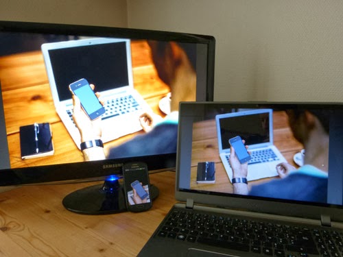
Extrapolating the reading distance from the screen size is another possibility. Between the handheld phone, the tablet on our knees or on the breakfast table, the laptop screen, the office computer screen or the big TV screen in the living room (not even talking about the Google Glass), each device has its own uses to which we have to adapt our designs.
As defined by his author Craig Mod, Bibliotype is a (very) simple HTML, CSS and JS based library for rapid prototyping long-form typography and reading on tablets. Its menu proposes a set of predefined typographic parameters to match the current users way of reading (and general habits): the font size in situation, or rather the general size of the page elements, whether they are text or images (i.e. bed, knee, breakfast), the justification of the text (ragged or justified), the font family (Georgia or Helvetica), the contrast of the page (low or high), and the hyphenation of the text (on or off). By empowering the user with these settings (and saving them as profiles for later use would be a must), this library offers really useful insight of what could be done to fit the actual use of the reading device, focusing here on tablets.
Each device also has its own means of interaction (keyboard, mouse, touch screen) with which we have to deal. Tools like Modernizr provide an interesting overview of the supported features.
The ambient lighting into which the device is used can make it really hard to read. The level 4 of media queries proposes a luminosity feature that can take three discrete values (dim, normal and washed), respectively for a poorly-lit, ideally or brightly lit environment. The idea behind it is to adjust both contrast and brightness of the design to adapt to the user's environment, which already exists in the applications realm. However, the brightness of the screen is usually taken care of by the device itself, and furthermore, each device has its own sensitivity, so this feature will be quite difficult to use in a right way.
Remember the evening edition experiment: everyday at 6pm, the display changes to reflect the time of the day. A very nice idea, but what if the user has f.lux installed? Then the device environment will compete with the site design, and the result may not be very nice.
By detecting the distance of the reader's face to the screen to adapt both line height and font size, Marko Dugonjić proposes a truly new way of thinking out of the box. headtrackr, his javascript library, uses the webcam to capture the user head, the webRTC API (web Real-Time Communication) and the HTML5 getUserMedia standard, hence only supported by Firefox and Chrome up to now.
If you need a web design responsive from the start without all the hurdles of setting everything by yourself, you can buy one directly on a responsive theme marketplace. Whether they are exclusive (you are the only user of that theme) or non-exclusive (anyone else can set up a website with the same design), they enable you to focus directly on your content and on your site specificities. The Gridgum site I am linking to here can help you monetize your responsive designs too if you are a designer.
Some vocabulary
We sometimes use terms which seem very close, but covering different realities, like the apparent similarity of fluid and elastic designs. A fluid design is expressed in percentage, this is the viewport size that defines the display. An elastic design is expressed in em, this is the user's choices, i.e. their display parameters like font size or zoom level which are preponderant.
Tabs
Tabs can display a lot of content on the same page, while we move between them in a horizontal way. This is where the problem lies when we try to adapt them to a mobile experience, where horizontal space is most often reduced. What can we do then?
We can convert the tabs into menu items. Where one page only could display a bunch of them, we get a series of pages (or cards/div/layers piled up onto the same page), with only the first one being visible. This way, tabs are transformed into accordions. Chris Coyer's solution enables us to separate the tabs menu from the main navigation menu to avoid them entering into conflict.
Legibility and line length
The reading speed of a lambda reader is quite the same between 35 and 95 characters per line. However, the optimal line length can vary between 50 and 75 characters per line.
Classically, the breakpoints, or switching thresholds, of your design can be constrained by the width of the used screen (although the effective area is not always the same).
Another approach consists in taking into account your content to define your breakpoints, quite often image widths, but the length of your text lines can also be used in your media queries depending on your type of content. Marie Guillaumet (in French) calls it proportional web design, the proportions of the texts and other blocks being always kept.
Many tools are there to help you out vizualising this line length optimization margin of flexibility.
Chris Coyer (once again) proposes a very useful bookmarklet to see that 25 characters frontier where to put your breakpoint.
FlowType is a javascript script that resizes both the font size and the line height of a text within the width of its parent element.
We can also note that when the line height is defined with no measure (nor px, neither em), it can be read as a multiplier for all the descendant elements. By eliminating its unit, the hassle of calculating the cascading relative height of the lines disappears.
Then responsive typography comes into play: line height, font size, hyphenation…
Screen size and uses
Extrapolating the reading distance from the screen size is another possibility. Between the handheld phone, the tablet on our knees or on the breakfast table, the laptop screen, the office computer screen or the big TV screen in the living room (not even talking about the Google Glass), each device has its own uses to which we have to adapt our designs.
As defined by his author Craig Mod, Bibliotype is a (very) simple HTML, CSS and JS based library for rapid prototyping long-form typography and reading on tablets. Its menu proposes a set of predefined typographic parameters to match the current users way of reading (and general habits): the font size in situation, or rather the general size of the page elements, whether they are text or images (i.e. bed, knee, breakfast), the justification of the text (ragged or justified), the font family (Georgia or Helvetica), the contrast of the page (low or high), and the hyphenation of the text (on or off). By empowering the user with these settings (and saving them as profiles for later use would be a must), this library offers really useful insight of what could be done to fit the actual use of the reading device, focusing here on tablets.
Each device also has its own means of interaction (keyboard, mouse, touch screen) with which we have to deal. Tools like Modernizr provide an interesting overview of the supported features.
A peek into the future
The ambient lighting into which the device is used can make it really hard to read. The level 4 of media queries proposes a luminosity feature that can take three discrete values (dim, normal and washed), respectively for a poorly-lit, ideally or brightly lit environment. The idea behind it is to adjust both contrast and brightness of the design to adapt to the user's environment, which already exists in the applications realm. However, the brightness of the screen is usually taken care of by the device itself, and furthermore, each device has its own sensitivity, so this feature will be quite difficult to use in a right way.
Remember the evening edition experiment: everyday at 6pm, the display changes to reflect the time of the day. A very nice idea, but what if the user has f.lux installed? Then the device environment will compete with the site design, and the result may not be very nice.
By detecting the distance of the reader's face to the screen to adapt both line height and font size, Marko Dugonjić proposes a truly new way of thinking out of the box. headtrackr, his javascript library, uses the webcam to capture the user head, the webRTC API (web Real-Time Communication) and the HTML5 getUserMedia standard, hence only supported by Firefox and Chrome up to now.
Start afresh with a responsive design
If you need a web design responsive from the start without all the hurdles of setting everything by yourself, you can buy one directly on a responsive theme marketplace. Whether they are exclusive (you are the only user of that theme) or non-exclusive (anyone else can set up a website with the same design), they enable you to focus directly on your content and on your site specificities. The Gridgum site I am linking to here can help you monetize your responsive designs too if you are a designer.
Design responsif : des pistes à suivre (in French)
Diseño responsivo: unos caminos a seguir (in Spanish)
Design responsivo: uns caminhos a seguir (in Portuguese)
No comments:
Post a Comment