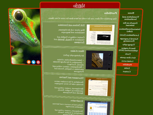
In most recent sci-fi movies, transparent screens are widely used: Iron Man 2, Minority Report, Avatar… They all have those future-like interfaces that help us project in a not-so-far future technology paradigm while being relatively close to ours. But why are they so widespread?
The response fits in one word: their cinemagenicity.
We all came across a neat facial recognition software in any TV show where a few tens photos are flipped through to show the software actually working. It gives a genuine visual sense of something actually going on.
The same is true with these transparent cinemagenic interfaces: you can see the actors from any angle while they are interacting with their computer systems. And that's their beauty.
Now, ask yourself: with all those talks about responsive web design, how your design is going to render on these screens? Is it still ergonomically stable and efficient seen from behind?

If you want to know more about the design of science-fiction interfaces, and what we can learn from them, you can read the book Make it So: Interface Design Lessons from Sci-Fi by Nathan Shedroff and Christopher Noessel (Rosenfeld Media, September, 13 2012), and check their blog Make it So.
The response fits in one word: their cinemagenicity.
We all came across a neat facial recognition software in any TV show where a few tens photos are flipped through to show the software actually working. It gives a genuine visual sense of something actually going on.
The same is true with these transparent cinemagenic interfaces: you can see the actors from any angle while they are interacting with their computer systems. And that's their beauty.
Now, ask yourself: with all those talks about responsive web design, how your design is going to render on these screens? Is it still ergonomically stable and efficient seen from behind?

If you want to know more about the design of science-fiction interfaces, and what we can learn from them, you can read the book Make it So: Interface Design Lessons from Sci-Fi by Nathan Shedroff and Christopher Noessel (Rosenfeld Media, September, 13 2012), and check their blog Make it So.
Pour Noël, offrez-vous un écran transparent ! (in French)
Para Navidad, ¡regálese una pantalla transparente! (in Spanish)
Para o Natal, ofereça-se um ecrã transparente! (in Portuguese)

No comments:
Post a Comment