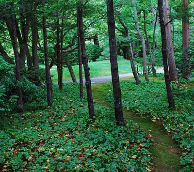
The fallow
At the 4th International Conference about Electronic Document (CIDE, Toulouse, 2001), we have presented, Thomas Polacsek and I, the concept of hypartextual fallow (pdf, in French), a new way to create links between documents.We based our approach on the work of the landscape designer Gilles Clément (Éloge de la friche, Lacourière et Frélaut editors, 1994), using the fallow as a metaphor of hypertext, going from the town planning desire path notion…
We are talking here about surrounding a building by a lawn, without putting any path towards it. The users will use that lawn through time, thus determining the most important paths. After a certain period of use, the architect has to settle them in time by paving them. In a way, the users have been made architects of their own living space.…To its application to hypertext navigation:
Using the fallow as a model means for the hypertext to have no entry point, nor exit point, and for each document being part of it to link to all the others. The users are “dropped” in the middle of the fallow, i.e. on any one of its documents, and need to create their own route, their own cognitive path, in the whole set of data around them.The principle was thus to create a complete hypertext, each data unit linking all the others, to let its visitors take possession of it and click through its links, then to freeze the most used paths after that training phase.
The adventure more or less limited itself to the presentation poster of the concept, some implementations on small size hypertexts have been done after that, without leading to any new publication.
The desire paths
And these days, the concept is reborn from its ashes under other skies, in the related field of information retrieval and web site navigability, via an article by Jim Kalbach and Karen Lindemann (Designing Screens Using Cores and Paths).The authors show the work of the information architect Are Halland who, in his presentation Core and Paths: Designing findability from the inside out (EuroIA Summit, 2007), proposes a web design method which consists in starting with the core (the content), then to develop the navigation from it.
We find again that concept of desire paths, this time via the architect Christopher Alexander (A Pattern Language, Oxford University Press, 1977) who advocates to place goals first, then to connect them with paths.
Of content and paths
But let's get back to Are Halland who develops a design technique, named Core and Paths, in three points:- Start with the core
- Define paths towards the core
- Define paths from the core
It is all about prioritizing the content and the functionnalities attached to it to meet the users' goals. Then we can make this primary content accessible (through faceted search, menus, search engine optimization, inbound links, newsletter…). Finally, we need to develop paths from this content (call to action, social sharing).
The core is thus the content we want to promote, the reason why users are coming: a relevant piece of information, a photograph, a video, a product sheet… It is surrounded by secondary data to enrich it (sources, characteristics, anecdotes, similar contents). We have to find the right balance between what the user is looking for (leisure, information, to buy a product, to compare products) and the goals of the content provider (information, promotion of a service, product sale, branding). This is actually that content that must stay on top whatever the device used to access it. Desktop, tablet or smartphone, the responsive web design techniques have to be applied to enable it to adapt itself to each type of screen and use.
This content fits in a flow of discovery and navigation. It has to be made visible through inbound paths within the site itself (internal search engine, faceted search, menus), as well as around it (blogs, search engines, inbound links, SEO, RSS feeds, affiliate network, newsletters, APIs). The content is now visible and accessible.
The next step is about giving life to it. Content should not be a nice vista at the end of a blind alley. It has to be completely inscribed in a navigation and consumption flow. From it, users should easily reply to a call for action: consume it in a purchasing act, give their address (email address for a newsletter subscription, Twitter account, Facebook account), add value to it (comments, score), sometimes in a crowdsourcing mode (categorization, translation, annotation), share it with social networks (and make it viral if possible).
Conclusion
Using a metaphor in the ideation stage enables the fast emergence of new ideas by transposing concepts from different fields. It is at the same time an interesting starting point and a picture that enables the easy explanation of concepts.We have seen how the concept of a path in the real world of urbanism can be applied to web navigation: from fallow to desire paths, from hypertext to content highlighting with different goals in mind depending on the actors involved.
In a gist
Content must remain the core of web design creation, itself thought as a discovery and navigation flow. There are three important questions to ask ourselves: what content to show, how to make it visible, and what actions to offer its users from it.Illustration credits: Elysse, via Wikimedia Commons.
Du contenu et des liens (in French)
De contenido y enlaces (in Spanish)
Conteúdo e links (in Portuguese)
No comments:
Post a Comment